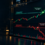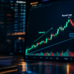
Trading charts may look confusing when you see them for the first time. Different lines, candles, numbers, and indicators can make the market seem complicated. However, once you understand the basic elements, reading a trading chart becomes much easier.
A trading chart helps traders understand how the price of an asset has moved over time. It shows important information such as price changes, market trends, trading activity, and possible areas where buyers or sellers may become active.
Learning how to read a trading chart is one of the first skills new traders develop. It helps you study market behavior, understand price movement, and make decisions based on information instead of emotions.
Daily Dunia shares educational trading and finance content to help readers understand concepts like technical analysis, chart patterns, and market tools in a simple way.
What Is a Trading Chart?
A trading chart is a visual representation of an asset’s price movement over a specific period. Traders use charts to analyze stocks, cryptocurrencies, forex pairs, commodities, and other financial markets.
Instead of looking at a long list of price numbers, traders use charts because they make patterns and movements easier to understand.
For example, if the price of a stock increases over several days, a chart can show this upward movement clearly. Similarly, if the price keeps falling, traders can identify a possible downtrend.
Most traders use charts as part of technical analysis, which focuses on studying past price movements and market activity. However, charts do not guarantee future price movements. They are simply tools that help traders organize information and analyze market conditions.
What Information Does a Trading Chart Show?
A trading chart contains several important pieces of information. Understanding these elements is necessary for effective trading chart analysis.
Price
Price is the most important part of any trading chart. It shows the current value of an asset and how that value has changed over time.
When traders look at price movement, they study whether prices are rising, falling, or moving sideways.
For example:
- A stock moving from $50 to $60 shows upward price movement.
- A stock falling from $60 to $45 shows downward movement.
Time
Every trading chart has a timeframe. The timeframe tells you how much time each part of the chart represents.
Examples include:
- 1-minute chart
- 1-hour chart
- Daily chart
- Weekly chart
A day trader may use shorter timeframes, while long-term traders may focus on daily or weekly charts.
Open, High, Low, and Close (OHLC)
Many trading charts display four important price points:
| Term | Meaning |
| Open | The starting price during a specific period |
| High | The highest price reached during that period |
| Low | The lowest price reached during that period |
| Close | The final price at the end of that period |
These values help traders understand what happened during a specific timeframe.
Trading Volume
Volume shows how much buying and selling activity occurred during a certain period.
High volume means many traders are participating, while low volume means less activity.
Traders often compare volume with price movement to understand the strength behind a market move.
How to Read Candlesticks on a Trading Chart
Candlestick charts are among the most popular chart types used by traders. They provide information about price movement in a visual format. Each candlestick represents a specific time period and shows the open, high, low, and close prices. citeturn0search4
A single candlestick contains three main parts:
Candle Body
The body shows the difference between the opening and closing price.
- A large body may show strong buying or selling pressure.
- A small body may show uncertainty between buyers and sellers.
Wicks
The thin lines above and below the candle are called wicks or shadows.
They show the highest and lowest prices reached during that timeframe.
For example:
A candle with a long upper wick may show that buyers pushed the price higher, but sellers later brought it back down.
Candle Color
Many charts use colors to show direction:
- Green candle: Price closed higher than it opened.
- Red candle: Price closed lower than it opened.
Candlestick patterns can help traders understand market sentiment, but they should not be treated as guaranteed signals.
You can learn more about candlestick patterns through Daily Dunia’s detailed guide on How to Read Candlestick Charts.
How to Identify Price Trends
One of the most important skills in reading price charts is identifying the market trend.
A trend shows the general direction in which the price is moving.
Uptrend
An uptrend happens when prices are generally moving higher.
Example:
A stock moves:
$40 → $45 → $50 → $55
The price is creating higher highs and higher lows.
Downtrend
A downtrend happens when prices are moving lower.
Example:
$80 → $75 → $70 → $65
The market is showing weakness because sellers are controlling the movement.
Sideways Market
Sometimes prices do not move strongly upward or downward. Instead, they move within a range.
This is called a sideways market.
During this period, traders often wait for a clearer direction before making decisions.
How to Find Support and Resistance
Support and resistance are two important concepts in trading chart analysis.
Support
Support is a price area where buying interest may increase and prevent the price from falling further.
Think of support as a floor.
Example:
If a stock repeatedly stops falling near $100, traders may consider $100 an important support level.
Resistance
Resistance is a price area where selling pressure may increase and stop the price from moving higher.
Think of resistance as a ceiling.
Example:
If a stock repeatedly struggles near $150, traders may watch this level as resistance.
Traders use support and resistance to understand important price zones. These levels are based on previous price behavior, but they do not guarantee what will happen next. citeturn0news24
How Trading Volume Helps You Read a Chart
Volume provides information about market participation.
When price moves with strong volume, traders may consider the movement more significant because more participants are involved.
For example:
- Price increases + high volume may show strong buying interest.
- Price increases + low volume may show weaker participation.
Volume is usually studied together with price movement rather than alone.
Understanding volume can help traders get a clearer picture of market strength.
How Indicators Can Help With Chart Analysis
Many traders use indicators to add more information to their chart analysis.
Indicators do not predict the future with certainty. They simply help organize market data.
Moving Average
A moving average shows the average price over a selected period.
Traders often use it to understand the general direction of a market trend.
RSI (Relative Strength Index)
RSI is a momentum indicator that measures the speed and strength of price movements.
Some traders use it to identify situations where an asset may have moved strongly in one direction.
MACD
MACD compares different moving averages to show changes in momentum.
It can help traders study possible changes in trend strength.
Daily Dunia also covers topics like Best Trading Indicators for Beginners, What Is RSI in Trading, and What Is MACD in Trading for deeper learning.
How to Read a Trading Chart Step by Step
If you are learning how to analyze a trading chart, follow this simple process:
1. Choose the Timeframe
First decide whether you are looking at short-term or long-term movement.
Choose a timeframe that matches your trading approach.
2. Look at the Overall Trend
Check whether the market is moving upward, downward, or sideways.
Understanding the bigger picture helps avoid random decisions.
3. Identify Support and Resistance
Mark important price areas where the market previously reacted.
4. Study Candlesticks
Look at candle sizes, wicks, and patterns to understand price action.
5. Check Volume
See whether trading activity supports the price movement.
6. Use Indicators If Needed
Indicators can provide additional information, but avoid depending on too many tools.
7. Consider Risk Management
Before making any trading decision, understand your risk and have a clear plan.
Common Trading Chart Mistakes
Many new traders make mistakes while learning chart analysis.
Looking at Only One Indicator
Using one indicator alone can create an incomplete picture.
Charts should be analyzed using multiple types of information.
Ignoring the Overall Trend
A common mistake is focusing on small price movements while ignoring the bigger market direction.
Using Too Many Indicators
Adding too many indicators can make charts confusing instead of helpful.
Entering Because of One Candle
A single candle does not always represent a complete market change.
Traders usually look for confirmation from other information.
Ignoring Risk Management
Understanding charts is important, but managing risk is equally important.
Changing Timeframes Without Reason
Switching between different timeframes without a clear purpose can create confusion.
Final Thoughts
Learning how to read a trading chart is an important step for anyone interested in financial markets. Charts help traders understand price movement, trends, volume, and important market levels.
The key is to start with the basics. Learn how candlesticks work, understand trends, study support and resistance, and slowly explore indicators.
Trading charts are tools for analysis, not guaranteed prediction systems. Building knowledge and practicing regularly can help you become more comfortable with market information.
For more simple trading and finance lessons, follow Daily Dunia’s Instagram page and stay updated with educational content. You can also join the Bull & Bear Whispers WhatsApp Channel for new finance and trading articles.